Less is more – the golden rule of logo designing.
What does a perfect logo look like? It should be simple, memorable and say as much as possible about the nature of the business it symbolizes. A lot has already been said about the design of brand logos, so the logo design process is best shown through specific examples.
We chose logos of three brands designed by Wide Vision as a case study. “Odeon” is a well-known cinema in Sochaczew, “Chroń morze” is an extensive project concerning the update of the marine water protection program, and “Pectore Eco” is a company that has been dealing with water management for years.
Odeon – a logo straight from an old cinema
The Odeon logo is inspired by old American cinema – the golden era of Hollywood. It is no surprise – the owner of this important cultural landmark on the map of Sochaczew is a true connoisseur and expert in film.
The logo is stylized in an Art Deco neon style. It is supposed to remind customers of the old cinema, i.e. the great cinema.
See also: How to design the perfect logo? Here are some key rules
The color yellow, reminiscent of a photographic sepia, fits perfectly with the retro character of the logo. Despite the graphic reference to 1930s cinema, the logotype is minimalistic and modern. It stacks up perfectly against other cultural site logos while maintaining its unique character.
The logotype also matches the cinema’s decor, the website we designed, and promotional and information materials (brochures or monthly repertoire).
Odeon Cinema logo – visualization
Odeon Cinema logo – brand book.
Effects:
Even our very first Brand Design project proposals have already been very well received by the client. We got permission to develop the concept in accordance with our vision. As a result, on the day the Odeon Cinema website was launched, it was visited by over eight thousand people, and a month before the cinema’s launch, social media gathered several thousand followers. Wide Vision still cooperates with the client, developing the design, as well as supporting the team in marketing activities.
Odeon Cinema logo on a bag and business cards.
Chroń morze – a logo like from a Disney cartoon
The aim of the Chroń morze campaign is to draw attention to problems related to marine waters, but also to the important role the Baltic Sea plays for the country. The identification, created from scratch by the agency, chose animals living in the marine environment as its main stars, bringing the campaign’s recipients closer to the problem.
Where did we start? At the very beginning, the client shared their inspirations with us, which gave direction to our work. The main goal was to create vector graphics of marine animals. Simple and colorful pictures referred to comic books, which are associated with explaining often complicated issues or life truths in a simple and clear way. The illustrative form perfectly matched the bold, saturated colors and shapes. The minimalistic approach allowed us to create modern, designer illustrations.
See also: MARKETING and PR – WHY WOULD YOU PAY WHEN YOU CAN DO IT YOURSELF!
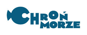
We also used the illustrative comic book form while creating the logo for “Chroń morze.” The graphic sign consists of the name of the project in which a shape resembling a fish is inscribed. It would be hard to find simpler and clearer symbolism. It is also worth mentioning that the “Chroń morze” logo refers in its shape to Disney film animations.

The logo of “Chroń morze”
The graphic sign of “Chroń morze”
Animals in a comic book style are an element of the visual identification of the “Chroń morze” campaign
Effects:
The logo marked the path leading to the creation of a visual identification that ensured consistent and effective communication. Both the logotype and graphics appeared in numerous promotional materials – in the printed and online press, as well as on event walls and roll-ups.
Seal – an element of the visual identification of the “Chroń morze” campaign
Pectore Eco – a logo of a company that serves nature
Pectore Eco is a company dealing with activities related to water management, environmental impact assessment of projects, as well as planning documents, and expert opinions. The company, operating since 2009, required a new visual identification, introducing a fresh perspective and referring to the company’s mission.
See also: Brand Book – what is it?
How did the beginning of our cooperation look like? The client contacted us with the intention of creating a new website, and we also offered them a new logo for their company. The old logo of Pectore Eco clearly showed the brand’s ecological mission, but it required a slight refresh, modernization, and simplification.
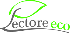
The new logo was designed in accordance with the golden rule: less is more. It consists of a graphic element that can function independently, and the full logotype is universal, suggesting specific associations to a potential customer (ecology, nature, trust, peace, etc.).
The modern logo also became the basis for the company’s visual identification and the new graphic design of the website. Pectore-eco.pl has gained a clear, user-friendly layout. The website is positioned for SEO.
Pectore Eco’s logo on business cards.

The old logo of Pectore Eco
The effects of creating the logo
The refreshed logo and new visual identification of Pectore Eco had a positive impact on communication with the recipients. Thanks to the website, the company could more easily reach a larger number of potential customers with its offer.
Pectore Eco’s logo – visualization.
How to create a perfect logo? Conclusions
There is no single rule that will help us create the perfect logo, which is clearly visible in the examples above. Each client has a different story, different business beliefs, and different requirements regarding the logo and visual identification. However, it is worth noting a few points that we can find in each of the three projects:
- customer inspiration and a clear definition of the company’s mission were helpful,
- colors and shapes play an important role,
- the logotype must match the nature of the project,
- less is more – regular shapes and minimalism are the key to success,
- universalism – logos should evoke specific associations,
- a logo is an important element of coherent communication.
See also: Advertising gadgets – which ones to choose for your company?
You need a logo and visual identification, but you don’t quite know how to go about it? Please contact us. We’d love to talk about your ideas. See our portfolio and write to us.

