
 PL
PLDesign, Marketing, social media
Screens and Branding: What Can We Read from the Beach?
Aug
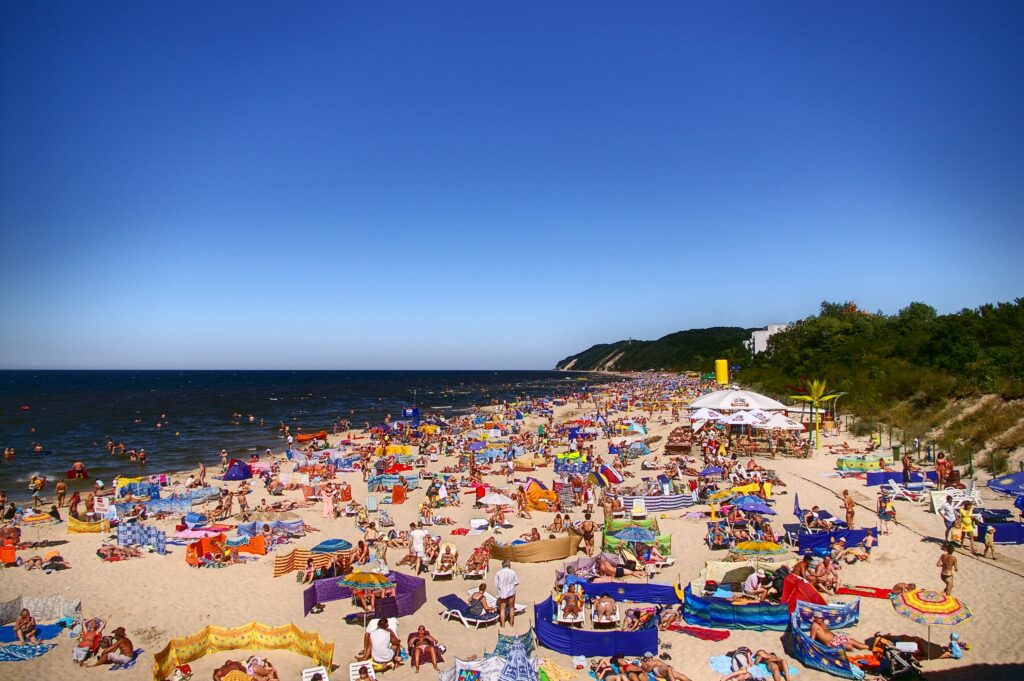
Some campaigns immediately make us think of summer. They evoke the taste of fried fish by the sea, an ice cream cone on a pier, or frozen lemonade on the beach. Everyone remembers ads related to upcoming holidays – whether on television or billboards. However, there’s another, less obvious place where we can find summer campaign branding: on beach screens.
What can a beach tell us about a brand? Quite a lot. Summer campaigns are a festival of color, designed to attract attention, refresh emotions, and evoke positive associations. Just look at the logos and slogans that appear on beach screens, deck chairs, and towels. And also… what’s not on them. You’ll immediately notice that nothing here is accidental. Summer branding is as carefully considered as the company name and logo.
Beach Branding: A Non-Obvious Way of Advertising
A screen is an excellent advertising surface: large, positioned at eye level, and virtually immobile. It’s no surprise then that many companies in the FMCG (fast-moving consumer goods – such as food and chemicals) sector, such as brewing and service industries invest in the production of screens with logos, which will be viewed for hours by sunbathing “neighbors” on the beach. For the manufacturer, this is practically free advertising in public spaces.
“Refreshment in Every Drop,” “A Taste of Summer,” “Catch the Moment” – beach slogans are simple, light, and almost transparent, yet they work. This is because beach branding shouldn’t be overbearing. It acts more like background music that sets the mood. Even if we don’t actively pay attention to them, we subconsciously record their presence as part of our vacation memories.
On the other hand, the beach is also a playground for amateurs: hand-made signs, symbols, and colorful fabrics can be found everywhere. They often create a kind of branding – they communicate where we come from, what we like, and what values are important to us. In this way, companies attract a public interested not so much in high-quality craftsmanship, but in slogans that convey something personal and are authentic.
Colors that Tell a Story
The most common “beach” colors? Blue, green, yellow, red, and white – hues associated with energy and freshness, but also simply with the beach, water, and a cloudless sky. These colors not only catch the eye but also reinforce associations with the product – blue is cooling, while red is refreshing and stimulating.
Sometimes the associations are simple. Yellow evokes the sun or sand, orange evokes fruity refreshment, and lush green evokes nature. These colors are often paired with white or pastels, which “calm” the overall effect. However, contrast is key – it’s what attracts attention in a maze of advertising. It can also strain the eyes if too bright, so it’s worth finding the perfect balance.
What Works? Short Series, Seasonal Colors, Local Themes
Summer is the perfect time to refresh your visual identity – even if only for a moment. Temporary color changes in campaigns (e.g., seasonal labels, outdoor advertising, social media graphics) act as a breath of fresh air. What particularly attracts audiences?
- Cool shades (mint, blue, lavender): are associated with relief and freshness.
- Water motifs (wave, drop, sunset): have a soothing and relaxing effect.
- Fruit and drink colors (juicy watermelon red, lime green, grapefruit pink): appetizing and perfect for Instagram 😉
What’s Tiring? Excess, Loudness, and Lack of Consistency
Summer campaigns should be lighthearted, but not haphazard. We all know how frustrating it can be to see an ad we don’t like. This applies not only to TV spots but also to images on nearby screens.
The most common mistakes we encounter in beach identification are:
- too many bright colors at once – they create chaos instead of excitement
- illegibility – yellow text on a white background sounds nice, but only in theory
- lack of consistency with the brand – if you normally stick to pastel and minimalist styles, neon signs can undermine credibility
What Else Do We Advise Against?
1) Color psychology doesn’t rest
Colors evoke emotions also in the summer. However, during the holidays, viewers are more relaxed, scroll faster, and are more likely to skip content that looks “too advertising-ly.” Therefore, it’s worth focusing on naturalness, authenticity, and context – for example, on photos from a lake with a subtle filter, rather than illustrations straight from a tanning salon with the famous palm tree.
2) Color in a campaign is not just about graphics
Summer colors should also be present in accompanying materials – video, audio (yes, you can “hear” the color), point-of-sale identification, packaging, and even language – for example, the names of seasonal products. When everything works together, the brand becomes part of the summer experience. And what evokes positive emotions and attracts attention in vacation photos is remembered the longest.
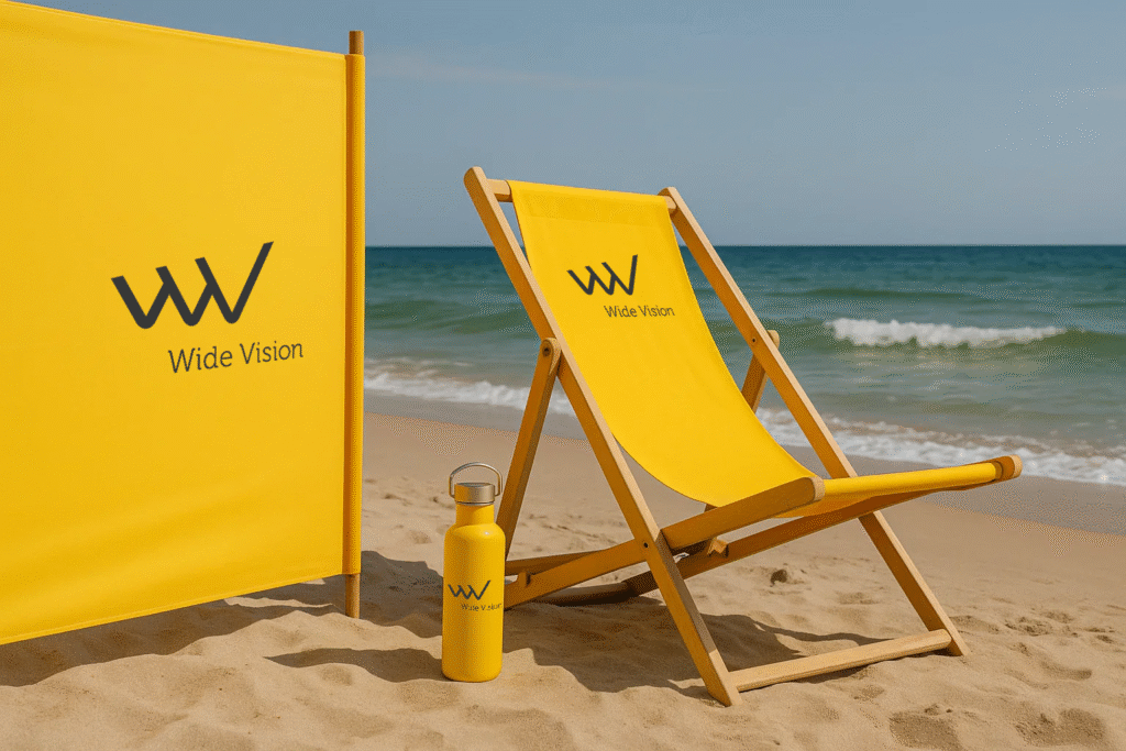
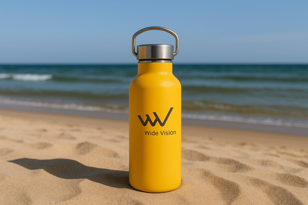
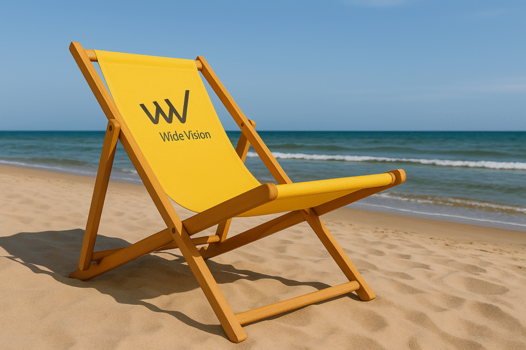
3) A towel can also act as a billboard
It’s not just the beach screen that deserves attention. Branded beach towels, bags, or deck chairs offer another space for promotion – often more discreet, but equally effective. Interestingly, they are increasingly being used by local brands, such as guesthouses, craft breweries, and kayaking tour operators.
Branding on a towel? The perfect souvenir and a mobile advertising medium. We can buy it in one seaside town, but we’ll take it with us on every cruise, Baltic Sea trip, and other maritime adventure. This way, the towel (and the company whose logo we can read on it) will be associated with beautiful weather, sunshine, and positive energy.
Does Beach Branding Make Sense?
From an agency’s perspective, it definitely does. It’s inexpensive to produce, durable, evokes strong emotions (relaxation, joy, freedom), and allows you to reach thousands of people daily. In an age when users are increasingly blocking online ads, a presence in physical spaces – even the most casual ones, like the beach – can prove to be one of the most authentic and effective formats. What we can observe on summer gadgets while sunbathing not only stays with us longer but also always evokes positive associations, which is what we care about most.
Check out what’s going on with us on Linkedin.